In the next few weeks, your awork is getting the biggest design update yet (version 4.0) – an important step that gives you more overview and a clearer way of working right away. The interface becomes tidier, the navigation more clearly structured, and all lists get a completely new foundation.
This article gives you an overview: what's changing, what stays the same, and when the update reaches you.
Feel free to share this article with your team so everyone's prepared.
[.no-toc]The key points in 30 seconds[.no-toc]
- What's changing? A cleaner design for more overview, a more clearly structured navigation – and reworked lists where you can now group, sort and display content as a table everywhere.
- How will you find out? The rollout starts in early July and runs gradually over about 4 weeks. You'll get a notification as soon as your workspace is up.
- What stays the same? All features in awork stay exactly as they are – they just look better and run more smoothly, so you'll find your way around right away!
Why we reworked awork
A while ago, our CPO Lucas shared in his LinkedIn newsletter what's behind the new awork update: the design was never just about look & feel, but about making awork easier to use – for every user, no matter their level.
So we set out to improve awork exactly where you use it every day: more overview, fewer clicks and more room for your actual work.
Over the past months we've poured a lot of time, effort, energy (and coffee) into this rework, and we're proud that it's not a cosmetic facelift.
Instead, the new awork gives you a major usability update you'll benefit from from day one.
More on that in Lucas' LinkedIn newsletter.
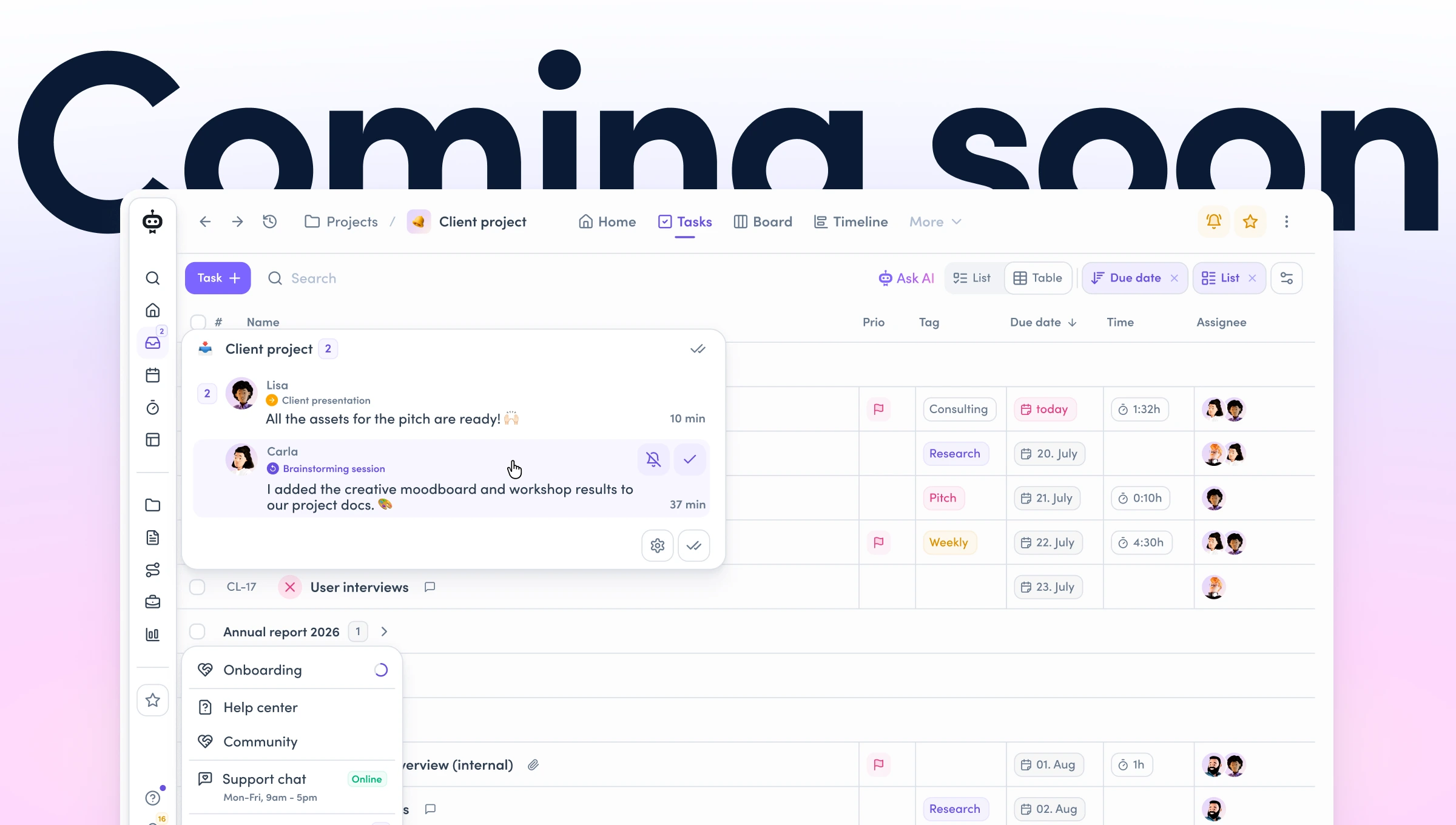
A cleaner design 🎨
The first thing you'll notice when you open awork
The layout is now more compact. Up to 30 percent less space needed means more of your actual work is visible on screen. Anyone working in a workspace with lots of active projects and full task lists will notice it quickly while scrolling and getting oriented.
On top of that, you'll now find consistent spacing and structure everywhere that make sense at first glance – no matter where you are. That helps your eye find what it's looking for faster.
Stronger contrasts in the design
New typography, a reworked icon set, a color system with stronger contrasts – together they create a clearer visual hierarchy on every page. So you can immediately see what's in focus.
More accessibility
In your account settings, alongside dark mode, you can now also adjust the contrast level from Standard to High – for better readability and more comfortable working.
A structured navigation 🧭
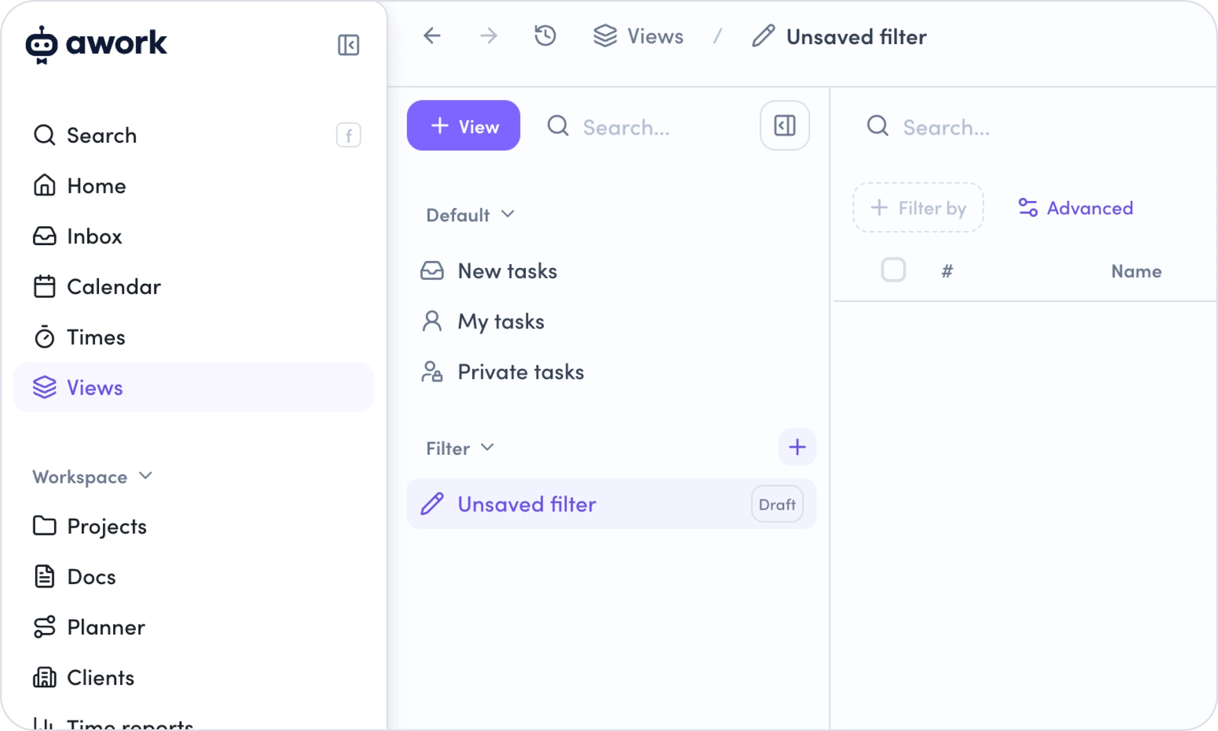
Here's how you'll move through awork going forward:
The new main menu
It separates individual areas more clearly: Personal content (Home, Inbox, Calendar, Times and Views), the Workspace level (Projects, Docs, Planner, Clients and Time reports) and the Quick access to projects (Favorites, Shared projects, My projects). This creates more overview and gives your favorites considerably more room than before.
App header and breadcrumbs
The app header (the bar directly above the page content, where you find the title and actions of the current page) now only shows what's truly relevant. New are also the navigation history and improved breadcrumbs (a clickable chain of links, e.g. Planner > Project name) – they always show you where you are, so you can quickly navigate back even in deeply nested structures.
Floating Action Bar
The Floating Action Bar (the fixed action bar at the bottom of the screen) bundles search, awork AI, quick actions and the timer as well as context-specific actions (e.g. zoom in a timeline or bulk actions in a project list).
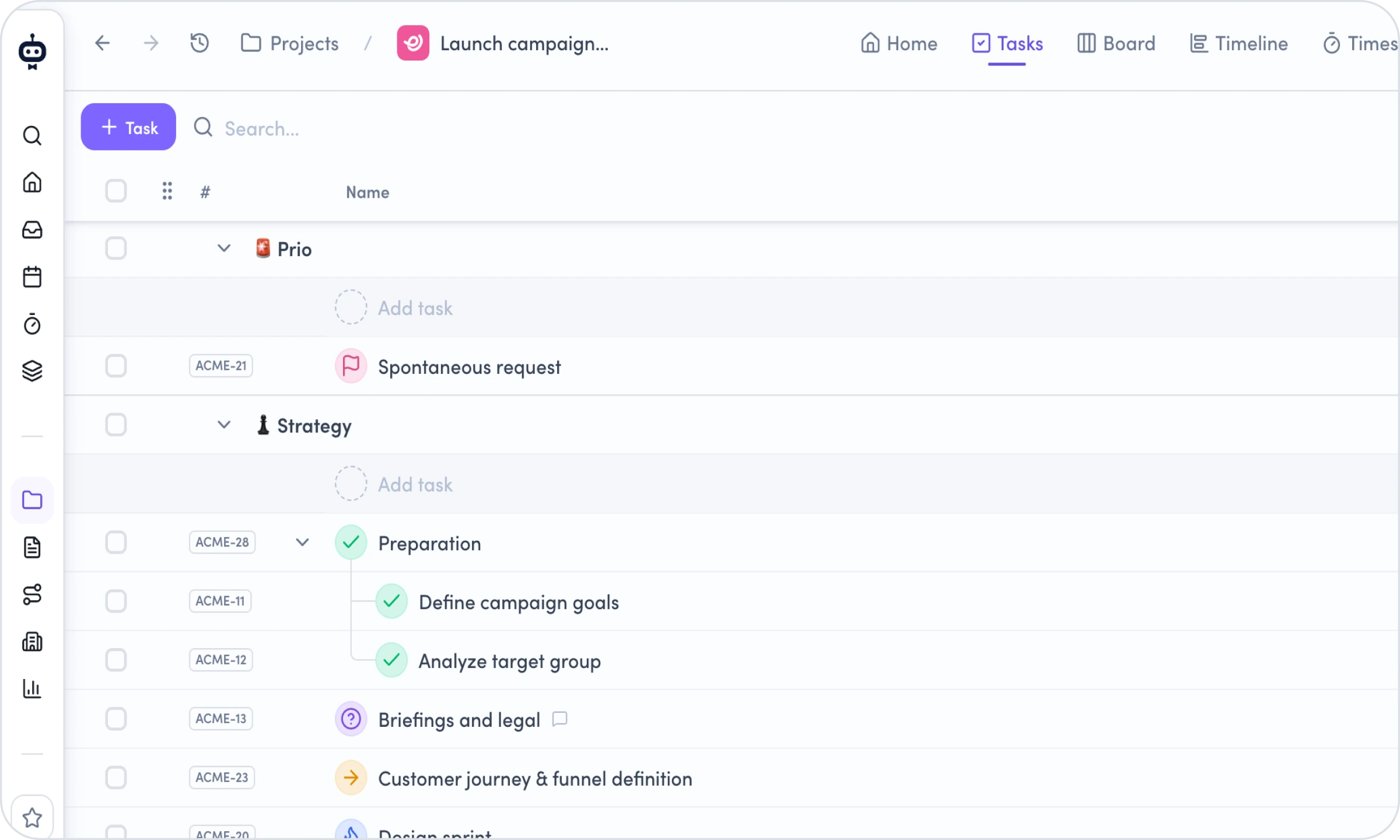
The new lists 📋
In project management, the list is the most important and most-used view, which is why we took a particularly big step when reworking it.
You'll find lists everywhere in awork – e.g. in projects, filters and views – and that's exactly where the most has changed.
Grouping and sorting
Until now, this was only possible in filter views. Now you can group and sort any list directly – by priority, due date, activities, status and more. So you no longer have to switch views first; you can adjust your overview right where you are.
📌 Example: You have an ongoing client project with 40 tasks split across five people. You want to quickly see who currently has too many open tasks – without leaving the project to do it. Open the task list, group by assignee and sort by due date. In a few seconds you'll see whose tasks are piling up and where you need to replan.
🚨 Heads-up: The classic task lists are also a grouping. If you remove it, you'll see the individual tasks without lists, sorted chronologically by task key.
New list layout
Every task now sits in a clearly defined row. That makes it easier to read the key info quickly, even in large projects. You'll also find improved behavior when manually editing order, parent and subtasks. With the new "handle" (6 dots on the left of the task column) you can now grab and move tasks more easily.
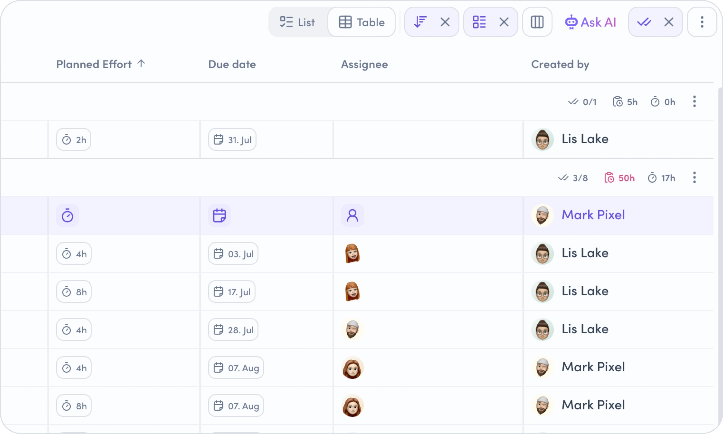
Table view
Every list can be switched to table view. You choose which columns you see in the table, in what order and at what width. Your awork remembers the configuration per list, so you can set it up individually for each project. And, as you probably know from other tables, you can simply sort any column ascending or descending to adjust your view.
Editing entire hierarchies
When you select a parent task, its subtasks come along automatically. Reassigning or moving a whole task group happens in a single action.
Consistent everywhere
With this update, you finally have the same components and the same options across all lists.
Goodbye, "why does this work here but not there?"
The rollout starts in early July 🎬
[.b-important-block]From early July, we'll roll out the update gradually. We're starting with the first workspaces and expanding week by week to ensure performance and a smooth experience. The full rollout is expected to take about four weeks.[.b-important-block]
[$tag]💡 Good to know[$tag]
As soon as the new awork is available in your workspace, you and your team will get a short tour of the most important areas. Got questions beforehand? Reach out to us any time → support@awork.com
What's coming next
Of course, we're not stopping here. The new update is the right foundation for building new features for a successful day-to-day in projects. These topics are already in the pipeline:
Quick Creator
Creating anything in awork becomes simpler and leaner – with full context (projects, times, tasks and more). So you can add new entries faster while always keeping the right context.
Improved timer flow
Time tracking gets even easier with a dynamic timer view. So you can capture your times right in your workflow – faster and without losing focus.
What about AI?
One of the most exciting questions for the future of project work: how can AI be integrated in a meaningful and valuable way? That's exactly what we're working on, step by step:
- Ongoing development of the internal awork AI
- Ongoing development of the awork MCP server and awork CLI
- awork Agents (coming soon) – the ability to build and use agents consistently in awork. More on that in this video.
Interested? Then reach out to us directly.
Where do I find things now? And all the answers at a glance 🙋
[.toc-name]Where do I find things now?[.toc-name]
In the Helpcenter, we've put together a complete overview: where to find search, the timer, projects, help and everything else after the update – including the most frequent questions and screenshots.